Summary of Data Filtering To-Date
This page explains, from the beginning, each step that was taken to identify the users of most interest for this analysis.
1. Initial Keyword Search
At the time of the event, Project EPIC collected 22,150,275 tweets from 8,000,942 users via a keyword search from the streaming API. These keyword-based tweets were collected between 2012-10-24 23:58:06Z and 2013-04-05 23:56:57Z. 16,233,401 of these tweets were collected before 2012-11-31. These tweets were collected via keywords such as sandy, hurricanesandy, frankenstorm, etc.
Of these 22M tweets, 260,859 are Geo-tagged. The geographical distribution of these is quite impressive, in just the first 5 days (until October 30), it looks like this:
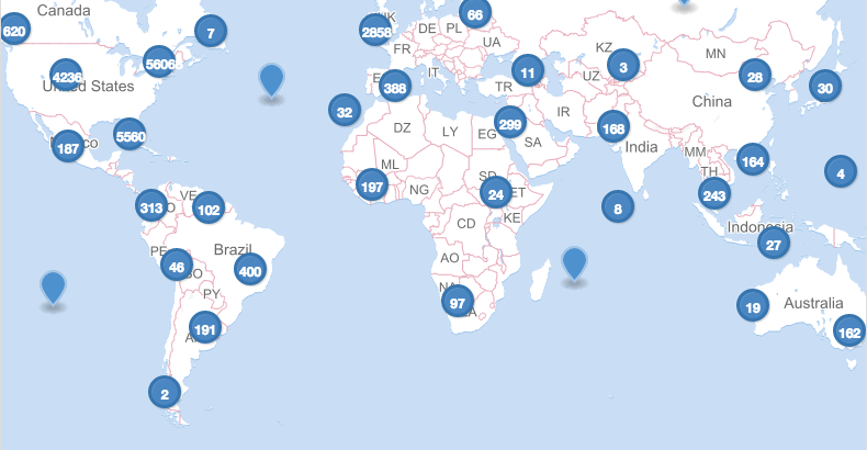
This image shows tweets about the event originating from nearly every continent. This particular graphic shows ~70k tweets from ~45k users. This highlights the need for a geographic bounding box to better focus our analysis on geographically vulnerable users.
2. Initial Bounding Box
For further analysis, the following bounding box was quickly drawn up between NCAR and Project EPIC to outline the potentially most-affected areas.
3. Fetching Contextual Streams
After the event, Project EPIC went back and collected the contextual streams for 23,528 users who had at least 1 geo-tagged tweet in the above bounding box. These streams are composed of all of a user’s tweets, not just those referencing the storm.
4. Calculating Home and/or Shelter Location
Using the contextual streams, The following method was used to determine a potential ‘home’ location for a Twitterer.
Part A. Cluster Analysis
Taking all of the geographical Twitter data we have for that user, we perform a geosptial clustering operation on it. The algorithm of choice here is DBScan. The advantages of DBScan is the ability to have a null collection as well as not needing to predetermine the amount of clusters.
Example of 6 Distinct Clusters: With user iKhoiBoi as a sample, we examine the contextual stream to develop a history of the user’s locations.
We also know from this clustering that the user is “classifiable” because they do have distinct clusters. Furthermore, the percentage of tweets which fall into the miscellaneous clusters is very low, only 4%, so we can be relatively sure that these clusters are significant to their movement + Twitter use patterns, in a recurring manner.
Part B. Temporal Analysis
With separate clusters determined based on the relative locations of Twitter activity, we need to attempt to determine a Home or Base cluster. By looking at the recurring time pattern of when a user tweets from these clusters, we can determine some level of regularity.
With the sample above, these scores are derived as follows. For any given cluster,
- Group tweets into distinct 3-hour time bins (8 different bins).
- Normalize each bin by the number of tweets.
- Sum the totals of each bin which has over 25% of the tweet activity.
- Return the sum * the number of tweets; representing the number of tweets which occur in a time-bin with > 25% of the Twitter activity for that cluster.
| Cluster | Total Score | Before Landfall Score |
|---|---|---|
| 0 | 35.0 | 29 |
| 1 | 115.0 | 6 |
| 2 | 4.0 | 4 |
| 3 | 12.0 | 12 |
| 4 | 3.0 | 0 |
| 5 | 3.0 | 0 |
This table shows the breakdown for all of this user’s tweets. We can see that cluster 1 is weighted very heavily in the total score, but if we look at just this metric calculated for tweets occuring before Landfall*, cluster 0 has the most regular tweet activity in this time period. Therefore, this user’s Home Location is believed to be cluster 0. Empirical analysis of the above map shows this to be a very reasonable estimation, located at the Dolphin Cove Condominiums.
*Currently this is using tweets from October 20, 2012 onwards; very good results have come from this; but it is possible to expand and re-run for more information.
5. New list of Geo-Vulnerable Users
Based on the Home Location as calculated above, we can identify the following list of users who are at most risk, based on further geographic filters.
Further Geographical Filtering
The next image shows the home location of users intersected with the above bounding box. 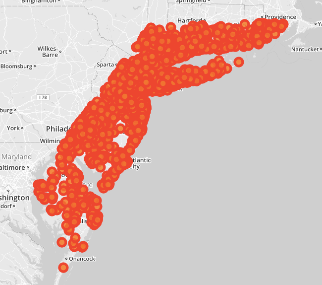
It’s clear that we have a lot of data and this particular bounding box is not very useful in this manner because it just shows the outline of the box itself; which is impressive in the distribution of users in general. Unfortunately, this distribution is very unequal:
As such, more geographic filtering is necessary; furthermore it was determined that there should be no single approach to identifying these users. To accurately assess their movement patterns, it is imperative to take into account the geographic differences in their locations.
As a first pass, we identified users along the coast, this is the 800 number we keep referring to. Users which we have qualitatively coded are in blue:
The users that we’ve coded so far are here:
Current Classification Metrics
Risk Levels by Users
6. Identifying Potential Evacuators
With a rough metric of evacuation as someone who left and came back.
7. Coded Users
In parallel to this work, and is now further along, the users identified above were qualitatively coded by their contextual tweet streams. As such, we know with some certainty which users evacuated by the content of their tweets.
Notable Complications
- Evacuation is very difficult to define from movement patterns alone; furthermore, movement patterns are difficult to define from Twitter activity alone. While I do believe there is valid data and good methods to work with here, these limitations must be acknowledged and taken into account.
- Hurricane Sandy brought about multiple types of evacuation behavior. An official evacuation was ordered before the storm made landfall; however, many people went home immediatley after to inspect damage (and tweet about it), only to leave again when power was not to be restored. Consequently, many people did not evacuate during the initial storm, but did choose to leave when power and heat were not restored. We also know that a winter storm came through during this time, making living without heat and power more difficult.
- Regardless of evacuation motives (ordered, chose to after the storm), we know that many people did leave. However it is difficult to quantify dates for analysis as to when the evacuation was over because the timing of people returning to their home location is very staggered.
- Evacuation movement behavior was initially thought to be a pattern of leave-and-return, but it has since become clear that this is not the case: Users tended to travel, stay at a variety of different locations, or simply not
Next Steps
We have only looked at a very small geogrpahic subset of our data. Acknowledging that this is certainly not a random sample and using what we’ve learned to adapt to NYC evacuation zones is a logical step.